
This is the second article in a series dedicated to helping people build better dashboards on the mobile web.
The first article ‘Building a mobile friendly dashboard in Google Data Studio’ introduced concepts such as structuring data around a customer lifecycle framework, designing intuitive mobile navigation and data visuals, in addition to integrating data from a growth backlog to support app improvements and drive KPI. If you haven’t read it, I encourage you to please check it out as we’ll be building on top of what was learned in that web tutorial.
Today, let’s continue our journey with Google Data Studio by making our mobile dashboards a little bit more pleasing on the eyes. We will be creating dashboard cards that help us understand the performance of articles within a blog against company KPI. These dashboard cards are designed to look similar to content that would appear within a social media feed, but with the added touch of including performance data for each article.
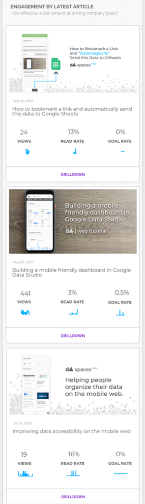
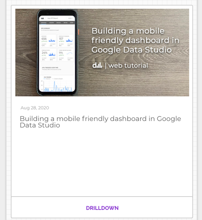
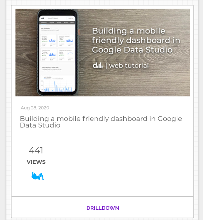
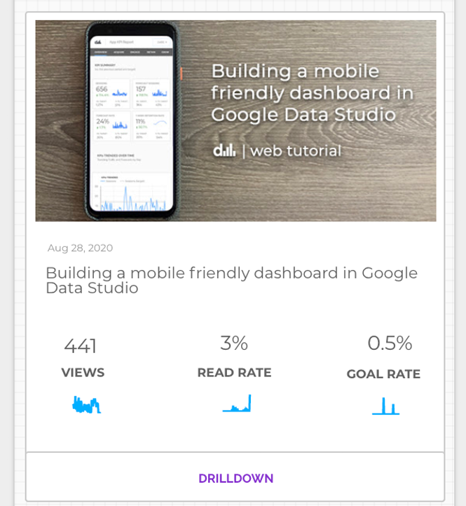
Here’s a screenshot and link to the dashboard cards that we’ll be building today:
Contents
This article will be broken down into the following 2 chapters:
Tutorial Requirements
This tutorial will cover topics related to building with Google Data Studio, Google Analytics, Google Sheets, Tag Management and some light Javascript. If you feel comfortable using the above mentioned tools or want to learn more, please read on!
Today’s Outcome
At the conclusion of this tutorial, you’ll learn how to:
- Develop data collection requirements needed to build a content feed in Data Studio
- Create custom javascript variables that scrape your blog and retrieve meta data about your articles
- Design a feed of dashboard cards which returns performance data about the last 3 articles published on your blog
- Blend data from Google Analytics and Google Sheets in Data Studio
- Export and Embed a Data Studio report into a web page, which enables us to easily view our report on the mobile web.
Now let’s get started and have some fun!
Chapter 1: Google Tag Manager Setup
Defining Measurable Content Goals
Before we dive into the wonderful world of tag management, it’s important to clearly define the outcomes or goals that you want to achieve with your digital content.
For example, the goal of this blog is to help people get better with the data they use everyday by providing useful information and tutorials that can be applied to their own work.
We also have a secondary goal to drive trial of our data spaces web app, which is a web platform that helps people organize their business data by providing an easy to use interface that enables bookmarking of tutorials, articles and reports like the one we’ll be building today.
We typically measure these goals through a combination of different levels of engagement with the blog and specific link clicks that drive product trial.
Your company blog or website may have slightly different goals to what is mentioned above, so please feel free to adjust the key measures as you see fit.
The purpose of this tutorial is to discuss how to create an article performance feed. How you measure the performance of your content, I’ll leave in your hands. That being said, if you do need any measurement assistance, please don’t hesitate to leave a comment below or connect with me on LinkedIn. 🙂
Now let’s get building this article performance feed!
Step 1: Defining Our Data Collection
In order to build our feed, we’ll need to collect the following data from our blog:
- The featured article image
- The title of each article
- The article publish timestamp
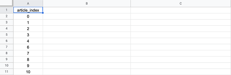
- Article Recency Index
The Article Recency Index identifies the article that was most recently published on your blog and assigns it a 0. The second most recent article would be assigned a 1 and so on.
At its most basic level, this index is just a row number that we are going to make available as a dimension filter in Google Data Studio.
Capturing the Featured Image Associated with Each Article
As with most articles on the web today, there is a preview or featured image associated with an article. This image is usually referenced via a meta tag called ‘og:image’.
If you were to view the source of an article and search for og:image, you might find a tag that looks something like this:
<meta property="og:image" content="https://blog.datanarrative.io/wp-content/uploads/2020/09/how_it_works_og_image.png" />We are going to capture this og:image data for each pageview in our blog using Google Tag Manager and use that image in our article performance feed in Data Studio.
If you are using WordPress, there is a great addon called OG WordPress Plugin which allows you to set a featured image for any article, and subsequently store that data in the og:image meta tag.
How to Save og:image data in Google Analytics
First thing we need to do is set up a custom dimension in Google Analytics. A custom dimension is where we’ll store the data associated with the featured article image.
To create a custom dimension in Google Analytics, open up the admin:
Admin > Property > Custom Definitions > Custom Dimensions
Then create a new dimension by clicking on the red button as shown below:
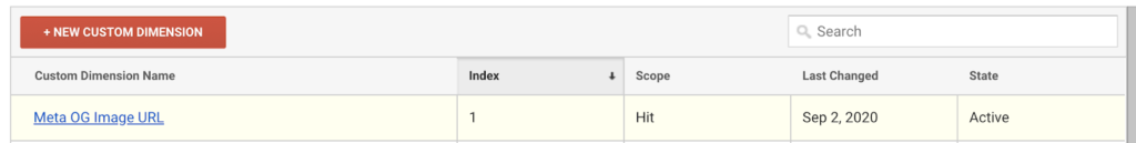
Next, name it ‘Meta OG Image URL’, choose Hit based scope and click save.
In this tutorial, i’m using Custom Dimension #1. Your setup may differ depending on what custom dimensions are available on your end.
While we are here, why not create another dimension to capture the publish date associated with the article.
Step 2: Capturing OG:Image and our Timestamp using Google Tag Manager
Now that we have our custom dimensions set up in Google Analytics, let’s create a few custom variables in Google Tag Manager to store this data. Custom variables allow us to capture any custom data when our pages load or an event is triggered. In this case, we’ll be using some custom javascript to scrape our article on load of the page, and subsequently pass the og:image data into our custom variable prior to being sent along as a custom dimension in Google Analytics.
In GTM, open up:
Variables > New Custom Variable, then select Custom Javascript
This should bring up the following window, where we’ll add some custom javascript to fetch the og:image url:
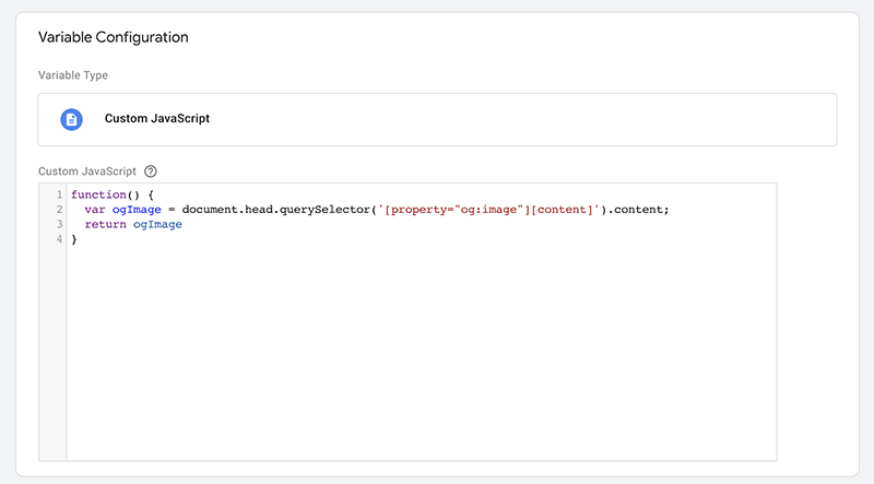
Feel free to copy this code:
function() {
   var ogImage = document.head.querySelector('[property="og:image"][content]').content;
   return ogImage
}
Save it as ‘OG Image Content Value’, then we’ll pass this custom variable along with all pageviews for our blog post. The exact method for how to do this will be outlined later on in this article.
Fetching The Article Timestamp
Create a new GTM variable for our Timestamp using the same methodology as above. In WordPress, this timestamp is made available in the following meta tag:
<meta property="article:published_time" content="2020-07-24T21:26:35+00:00" />Let’s create some custom JS and store this in a new custom variable called ‘Publish Timestamp’:
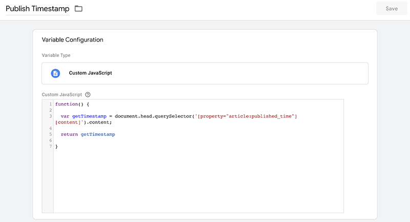
Here’s the code for you to copy:
function() {
   var getTimestamp = document.head.querySelector('[property="article:published_time"][content]').content;
   return getTimestamp
}
Next: Pass Timestamp and OG:Image Values to our GA Pageview Tag.
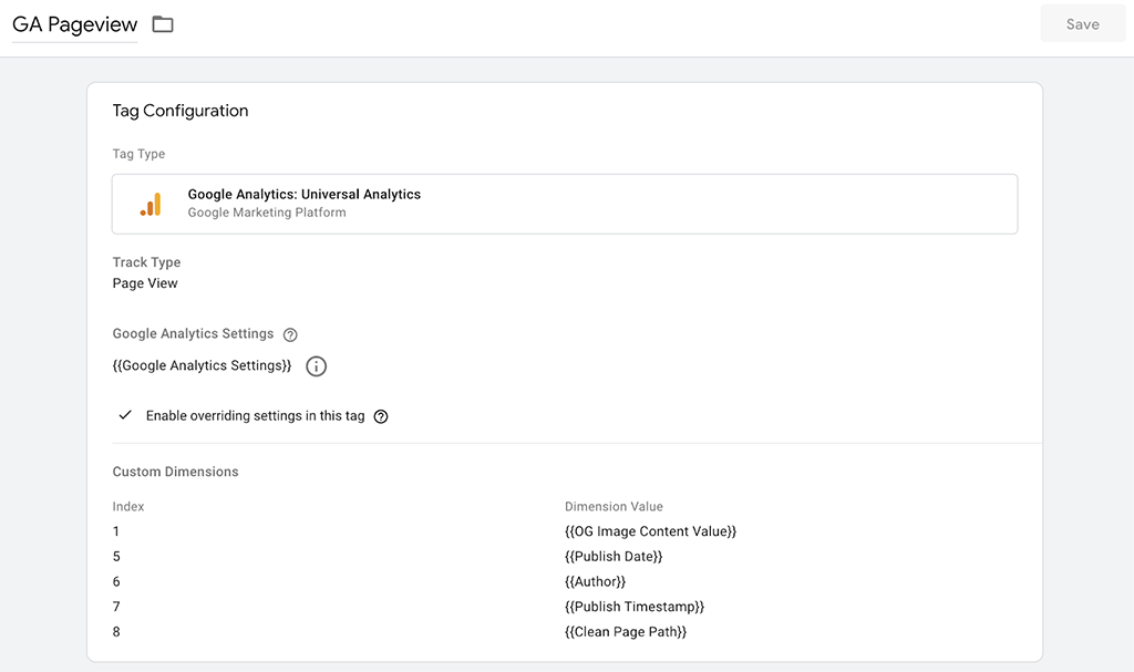
Open up your Google Analytics All Pageviews tag in GTM and store these variables in the appropriate custom dimension along with any other pieces of data that you want to capture. The GA Pageview tag should look something like this:
Great! Simply publish your container and whenever a post is viewed, you’ll send the og:image and the timestamp data along with the pageview request to Google Analytics.
Now Let’s Create an Article Recency Index
This is the most important step in this tutorial, but also the easiest!
Each blog post will have a number assigned to it, where 0 is our most recent article and 1 is our second most recent and so on. Then in Data Studio, we’ll create a card for each filtering on index 1, 2 and 3 respectively.
Here’s what that will look like:
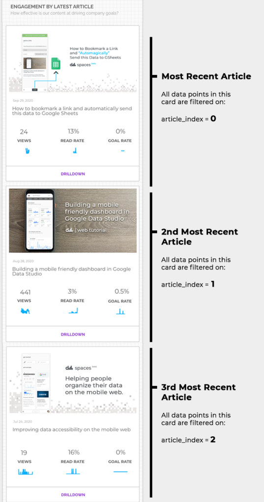
So, if we think of the index as a row number, we just need to build a query that returns our articles by publish date in descending order.
For this tutorial, let’s use Google Sheets as it is the most accessible way for everyone to build this type of report.
Building the Article Index with Google Sheets + Google Analytics Addon
For those that have never really pulled data from the Google Analytics API before, using the Google Sheets GA Addon is a great introduction.
I found the GA Addon for GSheets really helped lay a foundation for how to structure a query, and it made building queries in python a lot easier and more straightforward to understand.
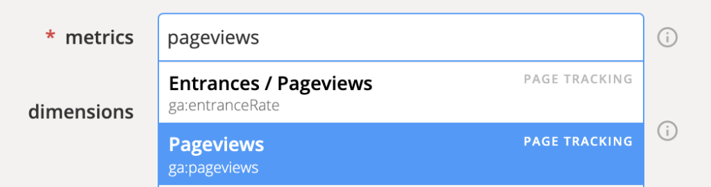
One other tip i found helpful when working with the Google Analytics API for the first time was to build your queries using the Google Analytics Query Explorer tool. It’s super helpful for understanding the syntax associated with all of the different dimensions and metrics.
For example, in Query Explorer I can type in the metric or dimension name and it would output the appropriate field required to query the API.
So if i typed in Pageviews, it would return ga:pageviews.
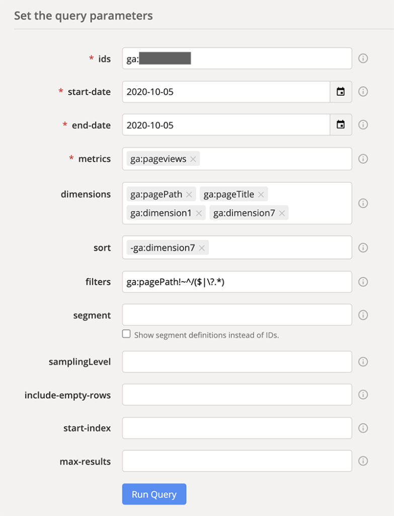
Build the following query in Google Query Explorer
And after we have done that we’ll re-build this in Google Sheets. Our query will need the following dimensions:
- pagePath
- pageTitle – Blog Article Title
- og:Image – custom dimension 1
- Publish date – custom dimension 7
- Any metric
We’ll sort our data by publishing date and will exclude our blog homepage as we only need data for our article pages.
Here’s a screenshot of what we’re building:
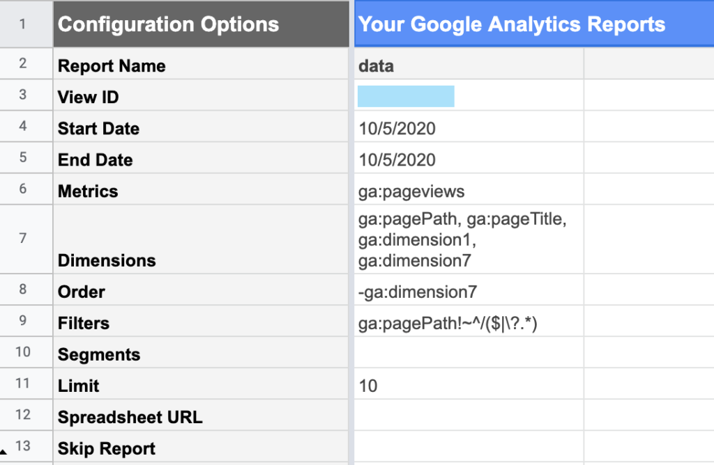
Now re-create this query in Google Sheets
Now take the query we just built and recreate it in Google Sheets using the Google Analytics Addon.
In Google Sheets, open:
Addons > Google Analytics > Create New Report
And recreate what we did in Google Query Explorer. It should look something like this:
Now let’s run it by selecting the following from the Google Sheets Menu:
Add-ons > Google Analytics > Run Reports
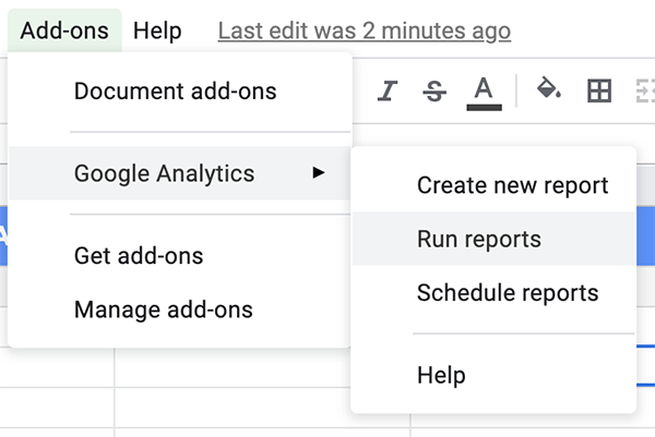
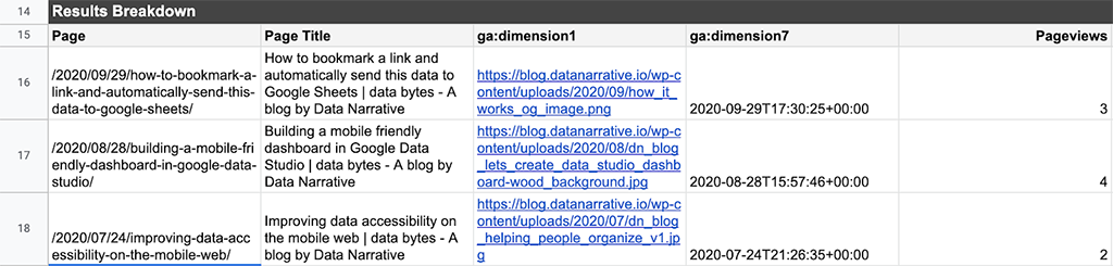
and open the ‘data’ tab to see something similar to the following:
OK…for real now. Let’s create the article index
Open a new worksheet, and in column 1 create the following:
Then in Cell B1, add the following formula to fetch the contents of the ‘data’ worksheet, ordering by most recent date published:
=QUERY(data!A15:E30,"select * order by D desc,-1")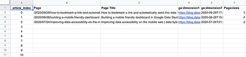
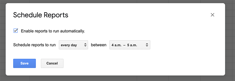
Next, schedule this data to run everyday, so you’ll always return the most recent articles with your index. Our index data will be dynamic and will change every time we release a new article!
Addons > Google Analytics > Schedule Query
Awesome! Now that we have our data configured, let’s bring this Google Sheet data into Data Studio and start building our article performance feed.
Chapter 2: Building the article feed in Google Data Studio
Now that we have our data collection all set up and ready to go, let’s begin building our dashboard!
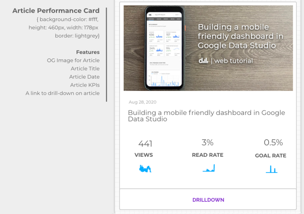
We’ll design the following card and then will replicate it twice more in order to create a feed of dashboard cards.
Here’s what we’ll be buidling:
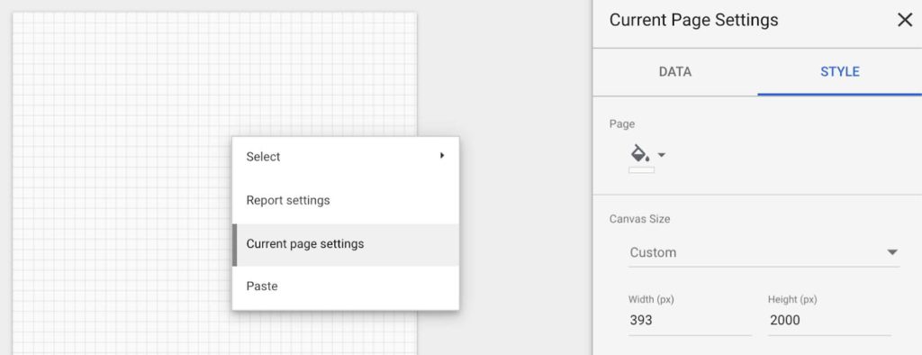
Step 1: Set the canvas size.
For a mobile dashboard that we’ll create, let’s set our dimensions to:
393 px wide x 2000 px height
To do that right click anywhere on the blank canvas and go to ‘Current page settings’ and set the dimensions above.
Step 2: Let’s import our data sources.
In order for us to power our article performance feed, we’ll need to connect to the following 2 data sources.
- Blog Data via Google Analytics
- Article Index data via Google Sheets
Next, let’s join these 2 data sources together so that we can always display our latest 3 articles as a ‘feed.’
A few data cleansing tips prior to joining our data
Always make sure that your data is as clean as possible prior to joining. Given that we will be joining the above data sources on the pagePath dimension, please consider:
- Joining these two datasets on a clean page paths without parameters. If you have a lot of parameters appended to your urls, consider cleaning these up prior to joining.
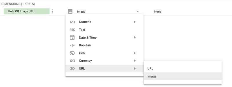
- Ensuring that our Meta OG Image URL is set as an ‘image’ and *NOT* a url as we want to render the image in our card.
To do this, edit your blog Google Analytics data source in Data Studio, find Meta OG Image URL custom dimension and set it like this:
- Your posts may include the title of your blog within the actual page title tag. If it does, you can remove it by creating a new dimension and leveraging the REPLACE Data Studio function, as seen below:
REPLACE(Page Title,” | data bytes – A blog by Data Narrative”,””)
Alternatively, you could have stored the clean article title in a custom dimension.
Step 3: Joining our Google Analytics and GSheets Data
This join will assign all of the blog pagePaths in our Google Analytics property with an article index, denoting how recently it was published. If it was the most recent article published, it will be assigned a 0. If it is the second most recent, it will be assigned a 1 and so on.
So, every time we publish a new article, this index will get updated with the latest article because we set our Google Sheet to check this and update the index everyday.
Here’s what our join will look like:
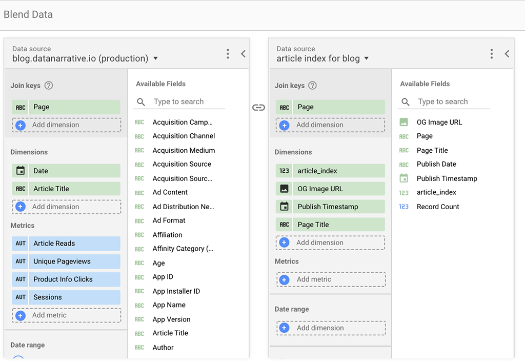
As you can see, I’ve also included the date dimension so that we can do light filtering over time. But, please note that this feed is specifically designed to report on the 3 most recent articles, and a report like this would be good for quick updates on the most recent articles that have been published.
We could try and get more sophisticated using data widening, Google Analytics APIs and python, but let’s table that for another day :).
Step 4: Creating our first card for our feed
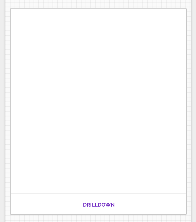
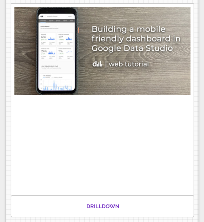
First build the card that will house the data. Include a link to another page so that we can provide the end user with some additional detail if they want to drill down into the article.
Add the OG image for the article
Create a table underneath our card with only the OG Image dimension and the article_index with NO metrics. In my case, you’ll see 3 images as I only have 3 blog posts!
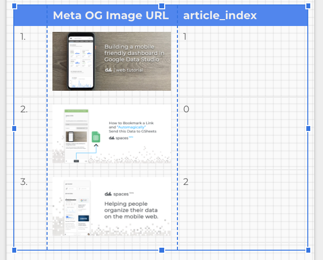
Remove the table header and row numbers by clicking on the table, opening the Style tab and unchecking ‘show header’ and ‘show row numbers’. It would also be a good idea to remove any gridlines as well to keep the design as clean as possible.
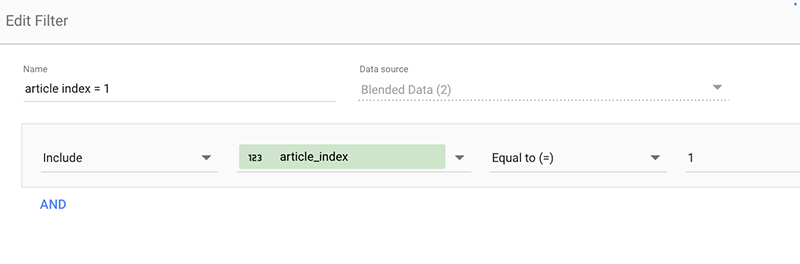
Now let’s create a filter on this table where article_index = 1. Essentially, we’ll be applying this filter (article_index=1) to each element within our card:
- OG Image
- Article Title
- Article Timestamp
- Any Metrics we choose
Here’s a screenshot of the filter:
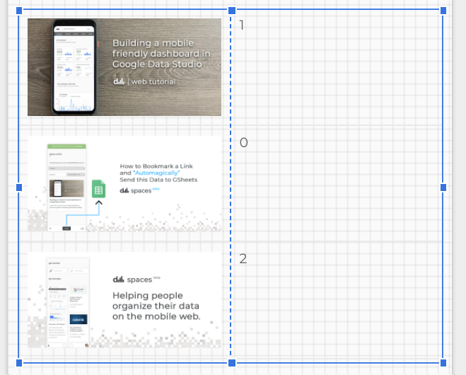
Next, remove the article index dimension from your table and place the image inside your card:
Note: If you don’t see an image, please make sure that you have selected the og:image dimension to appear as an image and NOT a url.
Next, let’s add the title and timestamp to our card
We can do this relatively quickly by just copying the image and changing the OG Image dimension to Article Title as we still have our filter applied.
Also make sure you wrap the text for your title dimension. Then repeat what we did for the Article Timestamp and you will have something that looks like this.
Also, you may want to consider cleaning up the date in Data Studio using the Parse Date Function like this:
PARSE_DATETIME(“%Y-%m-%d”, SUBSTR(Publish Date, 0, 10))
Next, let’s add some data to our card…woot!
Alright, now the fun part.
Let’s add in some metrics to better understand the performance of our article.
Let’s use a combination of scorecards and sparklines, which will paint a more holistic picture about the performance of this article. Let’s also hide the metric name in the ‘Style’ tab and then manually add it back in between the sparkline and our scorecard number.
Also, ensure that the metrics for this card include the filter: article_index=1.
Here’s the outcome:
Add in two additional metrics to your card, choosing something that aligns with your company’s content goals.
Here’s the result!
Great job! Now let’s create our next 2 cards in our feed
This is going to be really simple. All we need to do is:
- Copy the entire card
- Paste it beneath our original card
- Create a new filter where article_index = 2
- Apply the article_index = 2 filter to all of the elements in the new card.
Then repeat this again for article_index = 0. Remember, our feed starts at zero, which means you will have to place this card above the original card we made.
That’s it! Here’s the final result:
Final Step: Generating an iframe and add this dashboard to a mobile web page
One thing to know about this dashboard is that its width will scale when exported to an iframe and by embedding it into a webpage, we can easily view it on a mobile browser. So, let’s enable embedding in this report:
In the Data Studio menu, Click File > Embed a Report
Then check the box to enable embedding and copy the <iframe> to your clipboard.
Next, create a basic html page, and paste the embed code within the <body> tag, modifying the width to 100% and the height to 2000px.
Feel free to tweak this code for your dashboard
<html>
    <head>
        <title>Article Performance Feed</title>
    </head>
    <body>

        <!-- Add in your iframe code below -->
        <iframe width="100%" height="2000" src="https://datastudio.google.com/embed/reporting/45534bc3-2cbe-4ab7-a16e-11428b8b2577/page/IiPeB" frameborder="0" style="border:0" allowfullscreen></iframe>

    </body>
</html>
Then save and upload your html page to a protected space, and access the link on your mobile device and it should look something like this dashboard.
Congrats on building a content performance dashboard that is viewable on the mobile web!
Feedback
I’d love to hear your feedback on this dashboard design.
How would you make it better? How do you typically create mobile dashboards? What examples of mobile dashboards have you seen in Google Data Studio? What sorts of metrics do you include when measuring the performance of your content? How would drill-down into each article?
Please leave a comment below or reach out and connect with me on LinkedIn!
Thank you so much for your time and I hope you have a wonderful day!
Comments