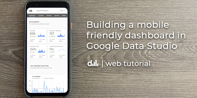
Executive Summary
In this article, we’ll be building this mobile product dashboard for the open source web app ‘forecastr’ using Google Data Studio and in the process we’ll learn how to:
- Organize data into categories such as Acquisition, Engagement, Retention and Growth
- Build a simple mobile navigation bar to jump to different sections of our report
- Create modern mobile UI elements such as data cards and product engagement funnels
- Integrate data from a growth backlog to tell the story about how we are going to improve our app and drive KPIs
- Join data together using Google’s data blending feature
- Create a simple web page for an iframe generated by Data Studio so that we can easily view our report on the mobile web.
At the end of this tutorial, you should be able to apply these learnings with your KPIs to build your own product or sales focused mobile dashboard in Google Data Studio.
Now let’s get started and have some fun!
Building mobile dashboards brings me a surprising amount of joy.
Maybe it’s the fact that we use our mobile devices to consume so much information in the world today, it just feels natural to check my phone for a quick business update. Oftentimes, it can feel like work to fire up the laptop and review some data.
But on my phone, something feels different.
What if our business data was easily accessible on a mobile device across the growing number of the platforms we use today? Wouldn’t that be amazing?
Sure, we’d still need our laptops to do the more intensive analysis and build presentations, but at a high level, our mobile devices seem like the ideal medium for us to consume quick business updates. Just enough information to spark an insight or question, to know what is going on, before we flip open our laptops and do that exploratory analysis.
This article is a first in a series designed to help people build better dashboards and organize the business data we use everyday from around the web.
So today, we are going to have some fun and create a mobile product dashboard in Google Data Studio and then embed it into a web page!
Why Data Studio you ask?
Aside from python, it’s my favourite place to explore and visualize data. It’s the canvas I use to not only tell the story of my business performance, but also what I’m doing to actively improve my business and drive my company objectives in order to reach my goals. And it only gets better if you know how to leverage python with BigQuery (but that’s another blog post 😉 )
Now, while this dashboard isn’t going to be responsive, it’s “good enough” to start thinking about how we lay out our data so that as we scroll through our dashboard, we’ll be able to fully understand what is happening with our product and identify opportunities to grow its usage. Along the way, we’ll have a few tips and tricks to work with the layout.
So, let’s imagine that we’re working on an open source web app that guides people through the process of creating a baseline forecasts and we want to make it better.
What would a summary KPI report for this app look like on a mobile device?
First up, let’s get our data sources in order
I’m going to assume that you’ve added data sources to Data Studio before, but if you haven’t here is a link.
To keep it simple and relatively brief, this tutorial will be primarily focused on building out the first page in this report. For this, we’ll be using a few data sources in this report sourced from:
- Google Analytics – forecastr (production data)
- Google Sheets – retention data, targets, and growth backlog data
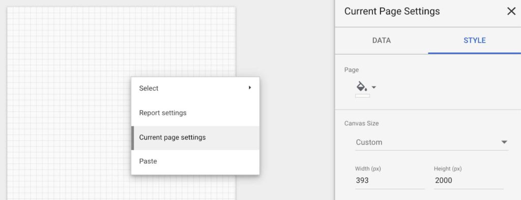
Customizing the Canvas Size
Now that we have our data in order, we need to pick a ‘mobile friendly’ screen width for our canvas.
For this dashboard, I chose 393px wide as I’m currently sporting a Pixel 4, but I’d recommend choosing anything around 400px wide in Data Studio. Or you could use a service like statscounter to find the most popular screen widths and start from there. In any event, when we embed this Data Studio report into a webpage and set the width of the iframe to 100%, the Data Studio report should scale within that space.
So, to set the size of your dashboard, right click anywhere in the blank canvas and select:
Current Page Settings
Then open the STYLE tab in the right menu and update the width and height of your canvas. As you can see in the screenshot below, i’ve selected a canvas size of 393 x 2000 px.
Next up: Building our navigation bar for our mobile report
In Google Data Studio embedded reports, the drop-down menu to navigate between pages in our report is only exposed on click of the dashboard (in addition to being at the bottom of the iframe). So, our stakeholders may not necessarily know there are additional pages to navigate to within this report.
So, let’s get a little creative and offer our stakeholders an alternative way to navigate to different sections within our report. We’ll do this by creating text links within a simple navbar to allow the user to jump to different sections within our report.
When analyzing product data, I like to break down a product performance story into the following sections:
- Overview – high level summary vs goals
- Acquire – where are we getting new customers
- Engage – how do customers engage with our product
- Retain – how well are we retaining customers
- Grow – what are we doing to grow our business and kpi
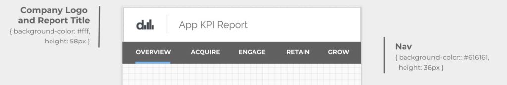
We’ll add these sections as text fields to our dashboard’s nav, in addition to a section for our company logo and report title.
I’ll also typically draw rectangles to house these elements using Data Studio’s Shape Tool for added clarity.
Here’s where we are at, complete with the properties of shapes used to contain our logo, title and nav bar.
Now, before we add a link to each text element in our nav, we need to create a few additional pages within our report. I typically like to duplicate pages rather than creating a new page as it keeps the existing formatting.
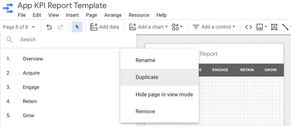
Click on the Page drop down and then click on the 3 dot icon, and select duplicate. Do this 3 more times and rename each to page to:
Overview, Acquire, Engage, Retain, Grow
Now, let’s go back to our ‘Overview’ Page and start adding links to each text element in the nav. Select the ‘Acquire’ text element to open up a panel in the right hand side of Data Studio. Click on the link icon and select the page to link to.
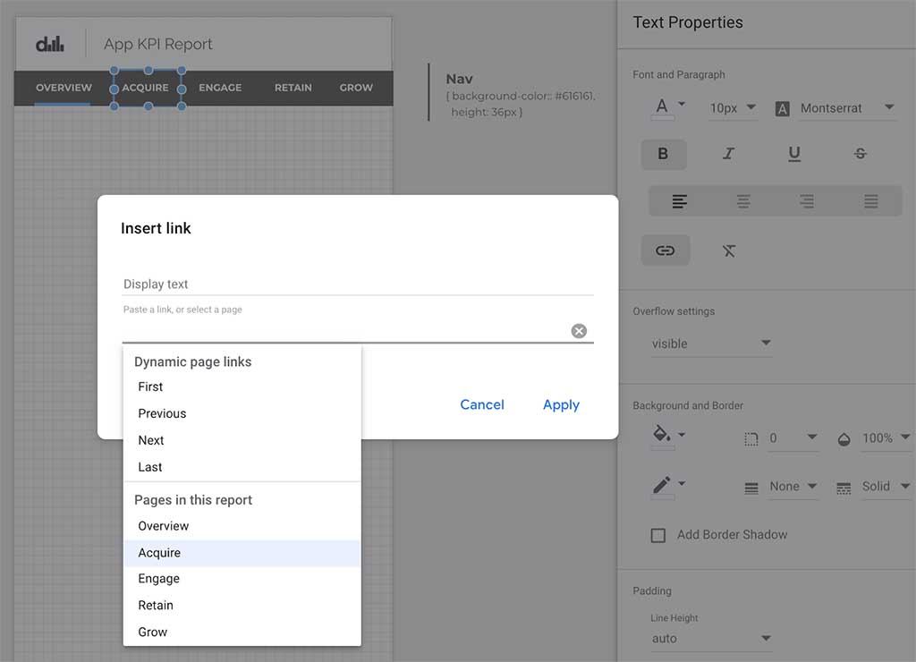
Repeat this process for each link. Then format the text color and remove the underline to clean up each link.
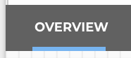
Then, for added clarity you could add a thick blue line underneath each link to denote what page the user is on like this:
Last thing you could do is to copy and paste this entire navbar and replace it with the ones on the other pages (to save you some time manually updating each link on every page).
Alright, our nav is looking great! Next up, let’s add a Date Selector to our nav.
Adding a Date Selector to Our Navigation Bar
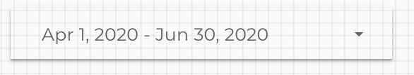
Typically, when adding a date selector to any Data Studio report, we can see the entire date range selected like this:
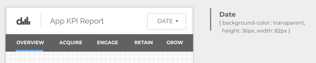
Now, unfortunately we don’t have the real estate in our nav to display this full timeframe, but when we shrink it down we lose the date and it just looks like a blank drop down which is not the greatest.
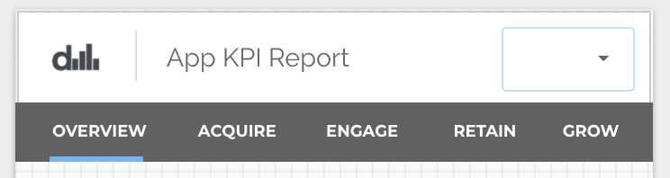
One thing we could do to bring additional clarity to this selector is to place a text field underneath this element.
Create a ‘Text’ element and label it as ‘DATE’, then right-click on the ‘date selector’ and select:
Order > Bring to front
Every element in our dashboard is layered, so we want our date selector to be on top of our newly created ‘DATE’ field so that when stakeholders click to change the date, they actually click on the date selector 🙂 .
Also remember to set the background colour of the date selector to be ‘transparent’ and you’ll get something that looks like this:
Whew! That’s a lot of work to set up a simple nav, but it’s totally worth providing our stakeholders with the best mobile reporting experience we can in Data Studio.
On to our KPI Summary!
Given that we have limited real estate, let’s focus on visualizing the performance of 4 topline kpis. It would be amazing to be able to horizontally swipe through KPIs in Data Studio, but until that day, we can present our data like this:
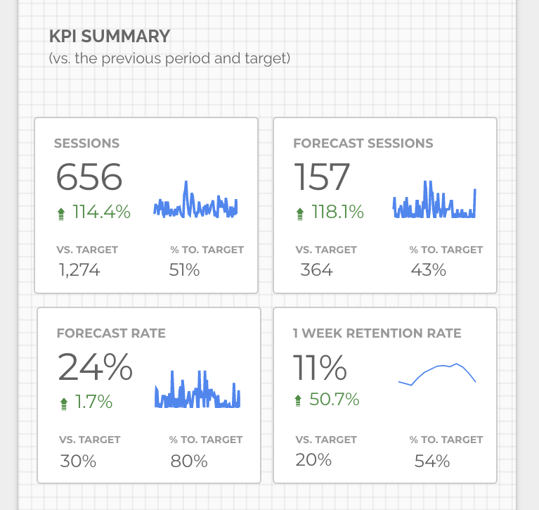
For this section, let’s focus on building the first KPI card, and then we can replicate it for the remaining 3 cards.
Your KPIs are obviously going to be different than what is presented here, but the overall setup for how we present KPIs should be consistent and similar.
When communicating the performance of a metric, it is good practice to put that metric into context, whether its vs a target, a prior period or some sort of baseline that you are looking to improve upon. In our example, we’ve set a target and also have compared it to the previous period’s performance.
If you are interested in a great breakdown of how to select the appropriate KPIs for your business, I’d recommend reading Allen Hillary’s Using Business Intelligence to Tell Your Product’s Performance Story.
Alright, here’s a detailed breakdown of the KPI card that we will build:
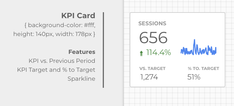
For the most part, this card is fairly easy to create as it consists of 3 scorecard visualizations and a sparkline graph of sessions.
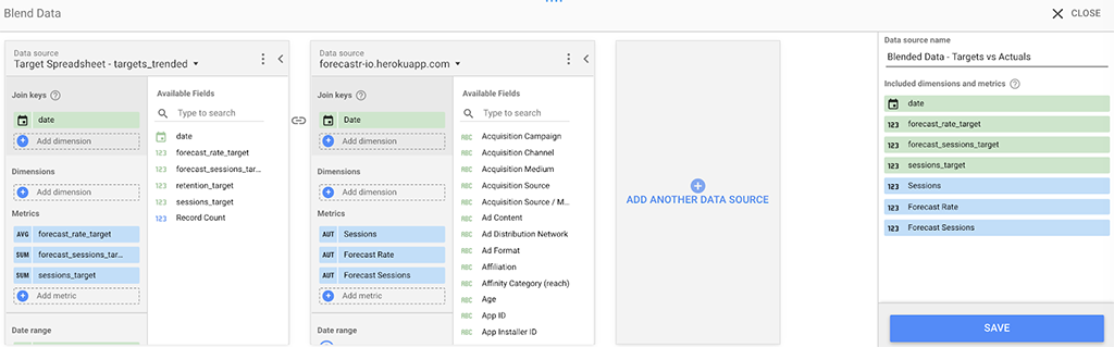
The only piece of complexity is calculating the ‘% to Target’ metric, which in order to render, we will need to blend the following two data sources:
- Google Analytics – Where your KPIs might live
- Target Spreadsheet – where our targets are going to live .
Joining these two datasets gives us a little bit more control over how we represent our targets over time, plus we get the added bonus of our targets being a bit more dynamic as we change time frames in our report.
Let’s Join Our Data
In order to blend your data, we first need to select the metric, and then select ‘Blend Data’ from the right hand menu:
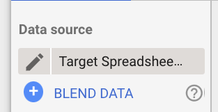
This will open up a data blending menu where we’ll select our desired metrics and join the two data sources on the ‘date’ dimension.
Great! Now, that we’ve joined these two data sets, we can perform a simple custom calculation to get the ‘percentage to target for sessions.’
In the right hand menu, click on a metric, then ‘Create New Field’, which will open up the following screen where we can create a simple formula for the % to Target.
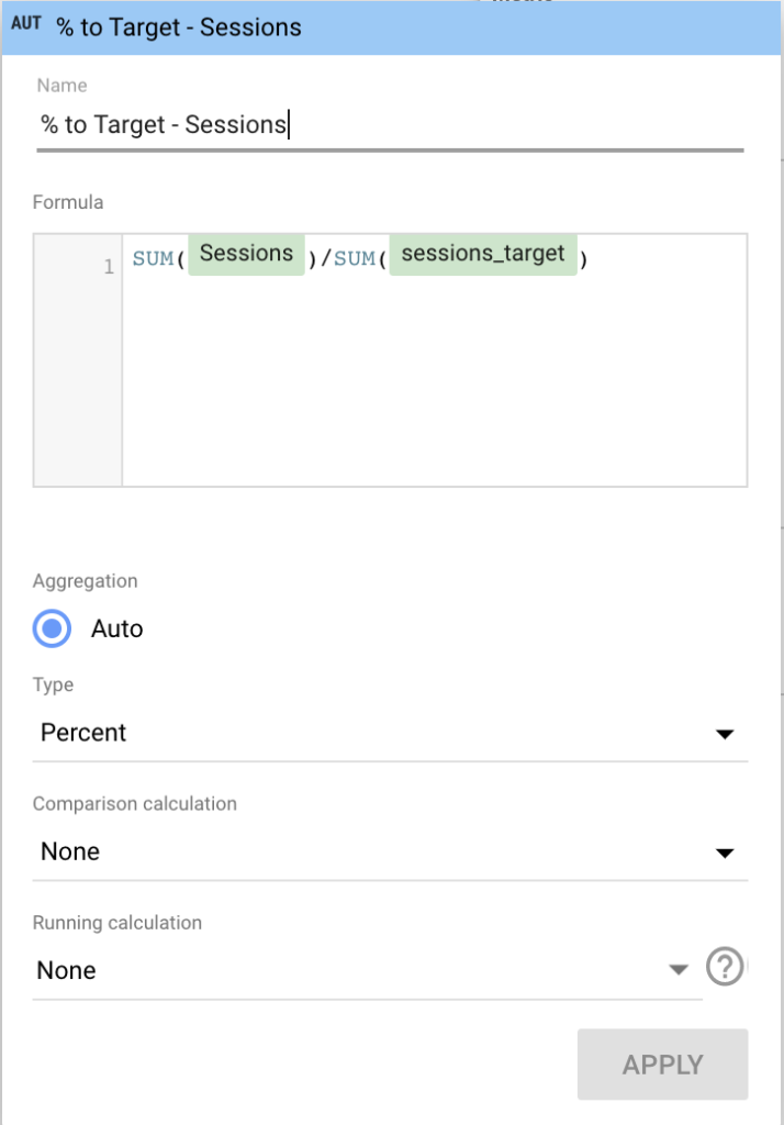
Awesome! Now simply repeat this process for the other KPIs you want to have targets against and we’ll have a nice high level overview of how our app is performing vs. the previous period and to target!
Next Up: Trending Out Our KPI
This next section might be the easiest one to create in this report as it is simply just a time series graph on top of a card, with some enhanced functionality.
Here’s what it looks like:
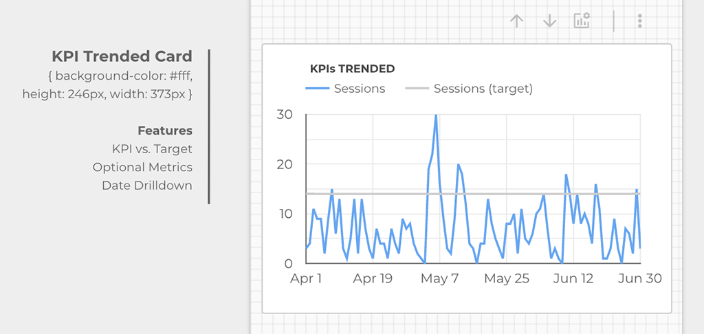
The main thing i’d like to touch on here is that you can use the up and down arrows above the card to toggle the date from daily to monthly views when you activate the ‘drill down’ switch in the right hand column. You can also add in optional metrics, so that you can toggle between different KPI, which is really handy.
Next Up: Building a Product Engagement Funnel
Unfortunately, an out of the box funnel visualization doesn’t currently exist in Data Studio. There are some community ones, but unfortunately community visualizations won’t render in iframes due to security reasons.
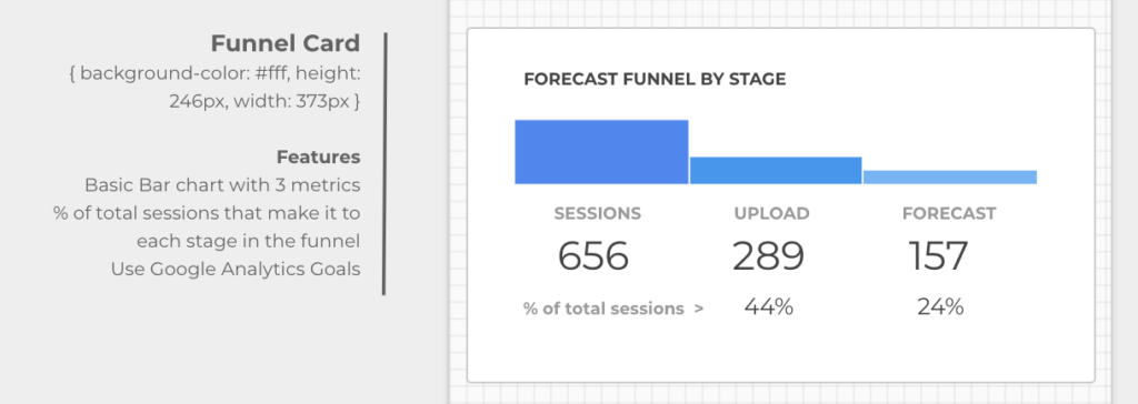
There is however a simple bar chart that we can use in conjunction with a few Google Analytics goals that are setup.
The basic idea is to create a goal in Google Analytics for each stage that a user hits in your product (or sales) funnel. In the following case, I’ve created a very simple 3 step funnel, measuring Google Analytics events as goals:
- Total Sessions to the App
- Total Sessions that Upload a CSV into the App
- Total Sessions that Complete a Forecast
Then all you have to do is select a bar chart in Data Studio and add in goal completions for each specific event as a metric.
Underneath the bar chart, i’ve included ‘scorecards’ for each metric at each stage in addition to the % of total sessions (ie. conversion rate) that make it to stages 2 and 3. This helps us see the drop-off and uncover optimization opportunities.
As you can see in the graph below, I’m seeing a pretty hefty drop-off between users that upload data and ultimately forecast within the app. So, there must be some issue here to explore!
After you set up a funnel for your data, it should look something like this:
Next on deck: The Product Growth Section!
This section of our dashboard contains a prioritized list of growth initiatives that your team is working on to improve your experience or KPI. This data can be sourced from a spreadsheet like this, or from a source like Trello.
The point of this section is to clearly communicate the top initiatives you and your team are working on to improve your business. It’s transparency at its best!
Originally, i wanted to use Romain Vialard’s awesome community cards data viz, but when i instrumented it and embedded the final result, it wouldn’t render as an iframe!!!! I love the idea of being able to add HTML, CSS and JS into Data Studio. If you are listening Google, please add this in as a product feature.
So, unfortunately we’ll manually create 3 cards, applying filters on each one for the top 3 initiatives we are working on. But when it’s done, it’s going to look great!
Here’s what we are building:
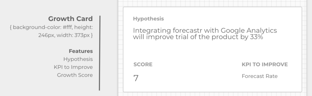
Essentially, this is just connected to a prioritized backlog of initiatives that lives within this Google Sheet.
Initiatives input into a backlog are scored (out of 5) across the following 3 factors:
- Traffic
- Development Effort
- Value
And then we sum up the Growth Score and rank our upcoming initiatives in Google Sheets using the following formula:
=QUERY(Backlog!A1:1000,"SELECT * WHERE I <> 'complete' ORDER BY M desc")Each card then has a filter applied to the data where rank = 1, 2 or 3 respectively. These cards represent the top 3 initiatives we are working on. Feel free to copy this spreadsheet and use it to prioritize your initiatives or hypotheses you want to test.
I’d also love some feedback on how you prioritize your initiatives / hypotheses. What could we do to make this spreadsheet better?
Now to the fun stuff! Let’s get this working on our mobile device!
The first thing we need to do is enable embedding in our data studio report:
In the Data Studio menu, Click File > Embed a Report
Then check the box to enable embedding (as show below) and copy the <iframe> to your clipboard.
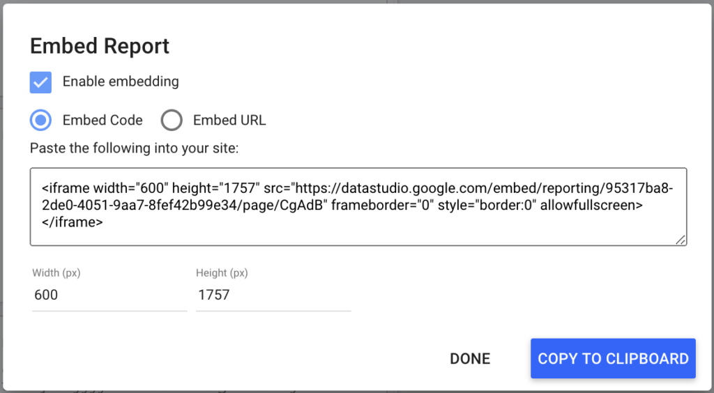
Next, we’ll create a basic html page, and paste the embed code within the <body> tag, modifying the width to 100% and the height to 2000px.
Here’s what that looks like:
<html>
    <head>
        <title>Forecastr Mobile KPI Report</title>
    </head>
    <body>

        <iframe width="100%" height="2000" src="https://datastudio.google.com/embed/reporting/95317ba8-2de0-4051-9aa7-8fef42b99e34/page/CgAdB" frameborder="0" style="border:0" allowfullscreen></iframe>

    </body>
</html>
Then save and upload your html page to a protected space, and access the link on your mobile device and it should look something like this dashboard.
That’s it! We’ve completed the Overview page and can now see our report on the mobile web!
Next up – The Acquisition Page!
Wait a minute…given the length of this post, how about we save this section and the others for another day? I’d love to hear your thoughts on how you drill down and look at acquisition, product engagement, retention and growth! So instead of diving into this, how about a quick bonus section instead?
Bonus!
If you don’t have a space or website to save an iframe, feel free to use our analytics platform called data spaces, which helps people organize their data and reports from around the web across the lifecycle of their customer base.
It’s free to use and makes it easy to save <iframes> like the ones generated by Google Data Studio! In my next article, I’ll show how to save a Data Studio report to data spaces.
Until next time, thanks so much for your time and for reading this article.
Feedback
I’d love to hear your feedback on the mobile dashboard design I have created.
How would you make it better? How do you create mobile dashboards? What examples of mobile dashboards have you seen in Google Data Studio? Have you had success rolling mobile dashboards out to stakeholders? What sorts of metrics do you include? How would you build out the next 4 pages in this report to give a more in-depth review of Acquisition, Product Engagement, Retention and Growth?
Please leave a comment below or reach out and connect with me on LinkedIn!
Thanks so much and have a great day!
[…] Building a mobile friendly dashboard in Google Data Studio […]
[…] first article ‘Building a mobile friendly dashboard in Google Data Studio’ introduced concepts such as structuring data around a customer lifecycle framework, designing […]