As business leaders, we all want immediate and easy access to data. It’s the fuel that supports the decisions we make everyday and increasingly what drives innovation in the market.
Making data more accessible to people is something that I’ve always taken pride in and strived to do as a data science professional. When we focus on making our company data more accessible, we:
- Move faster as an organization
- Are better aligned and informed about the performance of our business
- Build better insights and unlock optimization opportunities
- Create a more transparent and open business culture
- Create an environment where easy access to data can make us better at what we do.
It’s through this lens of data accessibility that I’m building an analytics web app called data spaces (or dspaces for short 😉 ). With companies generating more data than ever before across a growing number of platforms, effectively organizing data into a view that drives business value is critical to meeting our customers expectations & sustaining a competitive advantage.
What is data spaces?
data spaces is a web platform that aims to help save you time & simplify the organization of your business data into a single view of the customer.
It is free to use and helps you organize and pin production quality reports, access data science tools & templates and even save stories from around the web. Best of all, the data you save is exposed back to you in your own personal GSheet that you control in a #nocode kinda way 🙂
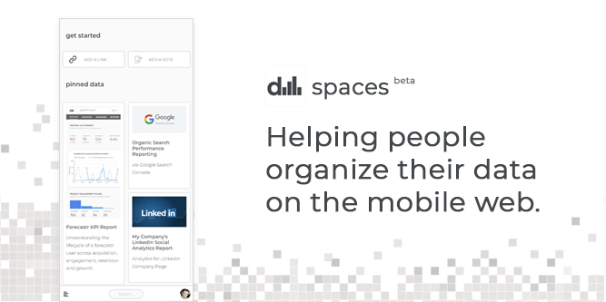
I’m excited to announce that with the latest release of data spaces, we have made significant improvements to our mobile experience and the site is now responsive on the mobile web! Gone are the days of looking at it on a phone unoptimized! You won’t believe how happy it made me to fix this side menu that was jutting out and taking over the whole screen on my phone. It was really horrendous, but that’s a data story for another time. I’m just happy it’s fixed!
Anyway, I know i’m a bit biased, but it is pretty amazing to have easy access to all of your favourite reports and data from around the web on a mobile device!
So what’s new in this release?
Before I dive into the enhancements, I’d like to take a minute to thank the amazing people at Rubellite Inc for their partnership and engineering support. They helped me transform the web prototype I built into a fully functioning web app. They are some truly talented engineers, amazing teachers and I wouldn’t be this far without them. So thank you for everything you have done. I really appreciate it.
Alright, let’s get down to business and talk about what’s new! Now while there are a lot of changes, i’m only going to cover some of the most significant updates as it relates to mobile.
So what’s new? Let’s break it down:
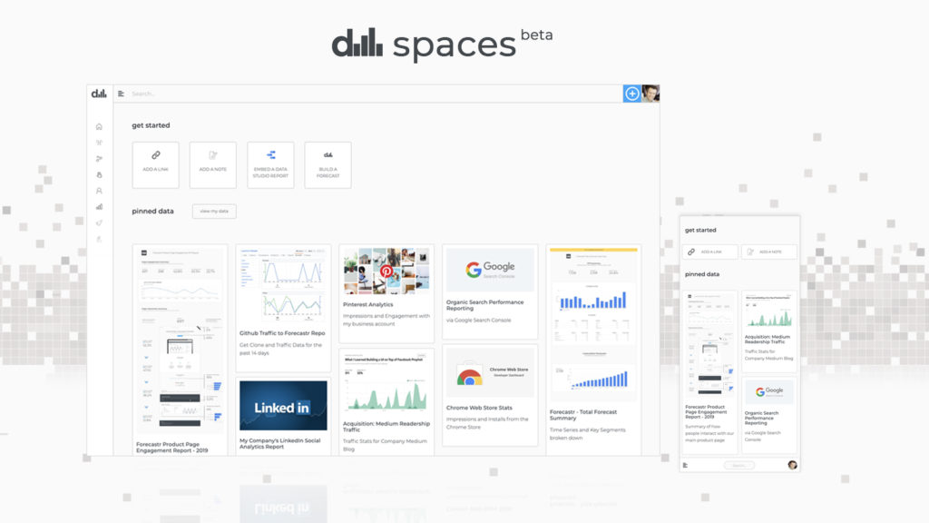
Full Screen Experience on Android
Now, when you add the app to the home screen on your android device, you can experience the app in all its full screen glory. This is the first step we’ve taken towards making it a full Progressive Web App and are really excited about how it’s shaping up.
Here’s a few screenshots of the all-new mobile experience.

Improved Saving Experience on Mobile
If you are anything like me, I love saving business articles for reading later. I used to copy and paste links and email them to myself, with some articles never to be found again! Now, you can save these links as part of the new data spaces mobile experience, which not only places these articles into a #savedstories section, but also saves the metadata associated with each article into your own Google Sheet. It’s super easy and can be done in a few easy steps.
Here’s what the new saving experience looks on mobile:
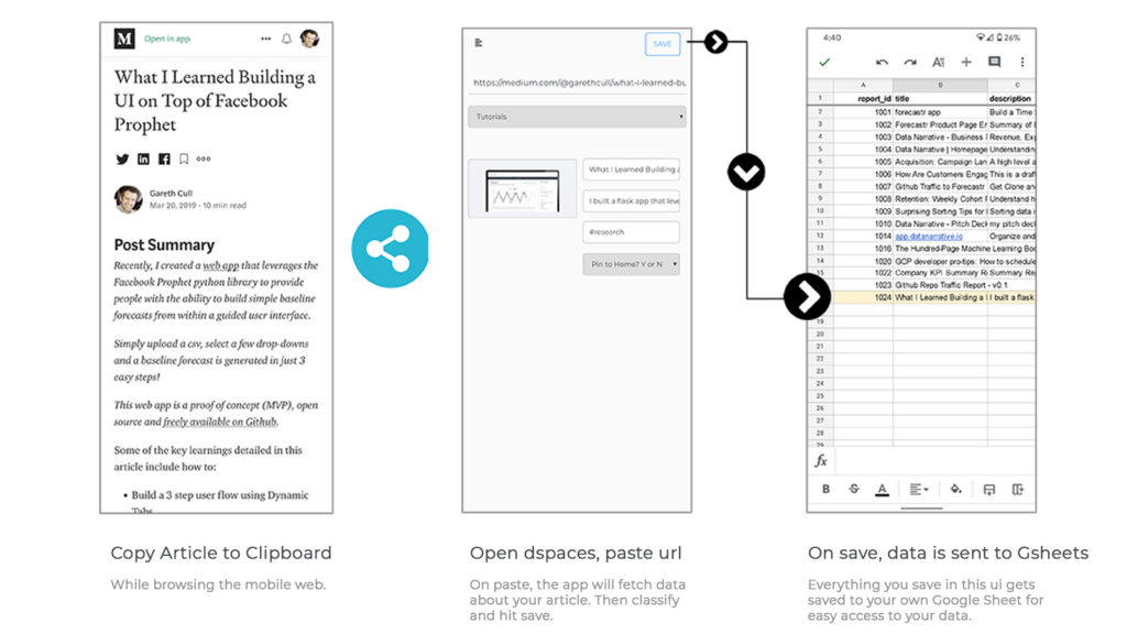
Pretty easy, and the app makes all of your data that you save in this experience easily accessible to you, by sending it to your own Google Sheet!
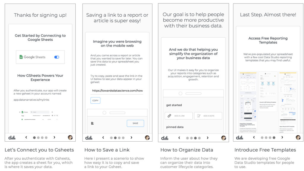
New Onboarding Experience
When we first launched the MVP, the user was thrown into the site and we received feedback that it was unclear what exactly to do first.
Acting on that feedback, we redirected the user to the /connect-to-gsheets page and presented them with a simple 4 step onboarding experience.
The goal with this onboarding experience was to communicate how the app works, and demonstrate how easy it is to save data from the app into your own Google Sheet. This is my first mobile onboarding experience that I designed and would love any feedback on how i could make it simpler.
Here’s what it looks the v1 mobile onboarding experience looks like:
I’m looking forward to iterating on this and testing different ways to onboard people and get them up to speed with how to use the platform. There are a few things i’d love to experiment with!
There’s so much more i’d love to share…
As much as I love long scrolling webpages, talking about data spaces and data accessibility, i’d love for you to login and check out our data spaces app and get your feedback on what we are building. I’m extremely excited about how the data spaces platform is shaping up and can’t wait to tell you more about what’s coming up next!
If you would like a demo of the app, please feel free to reach out to me on LinkedIn. I’d love to hear from you and help you make data more accessible for your organization and help you simplify how you organize your business data on the web.
Until next time! Happy data organizing!
Comments